Design to code:
Labora
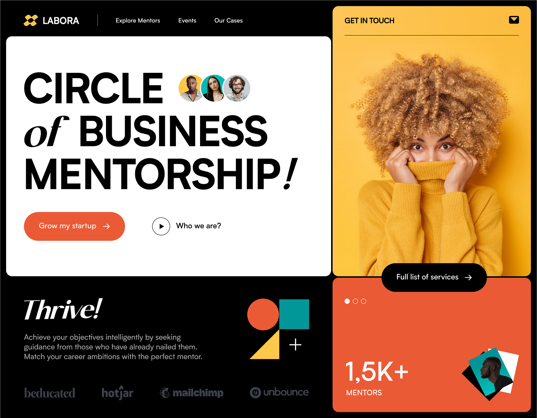
This is a design made by Halo lab
I’ve taken it and turned it into responsive, working code.
Cycle through the different device sizes and see what happens when you click the buttons ;)
Typography
This design makes use of two primary font styles: A bold and heavy sans serif, paired with a light classy serif.
Ironically, the combination of bold + heavy with light + classy creates a somewhat approachable, lighthearted feeling whilst still maintaining a sense of integrity, credibility and importance.
I used Hanken Grotesk for the primary sans serif font as it was bold, the characters were nicely rounded and geometric giving the font a feeling of friendliness, as well as having relatively open counters fuelling this feeling of trust and approachability.
I used Bodoni Moda as the serif font as it had a beautiful italic family and had a high stroke contrast highlighting the feeling of classiness and importance.
Colour palette
This design uses quite a simple colour palette:
It’s interesting how these colours are quite muted when viewed in isolation, however in contrast with the pure black background, they become incredibly vivid and make the design pop.
Controls
This design (in this state) only had a handful of controls: